| HOME | BOOKS | COMICS | RECORDS | NEWS | PEOPLE | PICTURES | ORDERS | HISTORY | office@savoy.abel.co.uk |
|
|
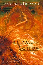
A Voyage to Arcturus (OUT OF PRINT) David Lindsay 2002 242mm x 162mm Hard covers 424pp ISBN: 0 86130 110 2 |
|
|
|
|
|
This is, we believe, the most definitive and prestigious edition
of Lindsay's masterpiece to have been published to date. Printed
on coated paper, with pages blocked in gold and jacketed in the
Symbolist visions of Jean Delville: a true collector's edition.
Includes rare photographs of the author.
Features: Prism and Pentecost: David Lindsay and the British Apocalypse— The Haunted Man—Colin Wilson's seminal essay on David Lindsay Philosophical Aphorisms by David Lindsay
"A Voyage to Arcturus demands that David Lindsay be considered not as a mere fascinating
one-off, as a brilliant maverick, but as one worthy and deserving
of that shamanistic mantle; of the British visionary and apocalyptic
legacy." "David Lindsay—a wonderful writer! A Voyage to Arcturus is a masterpiece! Jacket design by John Coulthart. |
|
|
Following the publication of this edition, writer Jeff VanderMeer asked Savoy's designer, John Coulthart, a few questions about the creation of the book for VanderMeer's
Vanderworld newsletter (www.vanderworld.redsine.com and www.vandermeer.redsine.com).
• When did you start planning for the Arcturus project and why did you pick this book? Some time in 1999 Matt Leyshon at Waterstone's book store, Manchester, mentioned that people kept asking him for a good quality reprint of House on the Borderland—he was ordering Tartarus and Ash-Tree Press titles at the time—and suggested to Michael Butterworth that Savoy might reprint Hodgson's book. This seemed like a good idea, particularly since Savoy's operations had gradually gone digital over the past few years so we suddenly had all the facilities to revitalise books that had been languishing since the mid-80s. The idea to do the book line grew from this. It was then simply a case of picking some titles: Matt's suggestion of William Hope Hodgson's book, which we will be doing next year, illustrated by myself; Maurice Richardson's Exploits of Engelbrecht, which David Britton had said for years that he wanted to reprint; A Voyage to Arcturus was the next obvious candidate for establishing a list of Savoy's 'cult' works. Dave believes Lindsay's book to be one of the greatest novels of the twentieth century—a partisan view, of course. It certainly suits the general Savoy canon by being unclassifiable despite being bracketed continually as fantasy or SF. Savoy has a history of dealing with mavericks of one kind or another; David Lindsay was a maverick if nothing else. • Tell me a little bit about what went into the design. How did you decide on the cover art, the fonts, etc? All the books to date have had designs that suit them individually, there's no attempt to impose anything like a 'house style'. Form follows content is usually my rule. Arcturus has been poorly served over the years, especially in its paperback incarnations where lazy editors (and illustrators) have tried to package it as some kind of sword and sorcery adventure. Since we've been doing a line of hardbacks, we wanted to avoid the generic fantasy trappings but still reflect the wildness of Lindsay's imagination somehow. I thought first about the Penguin Classics approach of filling out the jacket with a well-known painting. The rest of the decisions followed in quick succession: something by one of the Symbolists immediately suggested itself. The Belgian Jean Delville is probably my favourite of this group of painters and his "Treasures of Satan" is his most celebrated work. Delville's pictures are fuelled by his mystical and philosophical interests—he was a disciple of the Rosicrucian Sar Peladan in Paris, later became a Theosophist and follower of Krishnamurti—which makes him an ideal companion for Lindsay. His figure of Satan rearing over prostrated, ecstatic figures lying among jewels equates perfectly with the character of Crystalman, the Satan figure in the book, ensnaring the universe's creatures with the trappings of pleasure. There's also the bizarre details in the picture, the way it appears to be set beneath the sea and that Satan's wings are also suckered tentacles, something that corresponds obliquely to the bodily transmutations in the book. If you know something about Delville's history, there's a curious Scottish connection that seems appropriate as well: Lindsay's family were from Scotland, the characters in the book have to travel to Scotland before making their journey into space and Delville taught for a few years at the Glasgow School of Art. On the rear of the book we have Delville's "Angel of Splendour", a painting that I see as corresponding to Maskull's quest for Surtur in the book. The curators at Belgium's Museum of Fine Arts in Brussels (where "Treasures of Satan" is housed) sent a transparency of the Delville painting and were able to put us in touch with the owner of the other work so we could borrow a photo print—without this it would have been impossible to use on the cover. Anyone curious about Delville can see plenty of his pictures online at Art Magick: http://www.artmagick.com/artists/delville.aspx Regarding fonts, the main text is set in Garamond. Since we were re-setting the book from scratch (most copies in print contain errors—the US edition was virtually re-written when published in the sixties) I wanted to go for the most classical face possible; usually this means Garamond or Baskerville and I prefer Garamond. The great thing about digital typesetting is the way you can adjust tiny details: at every mention of the word Arcturus in the book we used a ligature that connects the letters 'c' and 't'. The display font for the chapter headings is Mason by Jonathan Barnbrook. Mason has become something of a cliché in SF and fantasy book packaging as it's a modern typeface with a slightly gothic look. For this reason I used its alternate form, it's less familiar and I prefer its angularity. I suppose in one way its familiarity helps connect the book back to the genres where it usually gets dumped, although this wasn't a specific intention. • How closely do you and Savoy work on a book? Does they review your design and contribute ideas, or...? Everything Savoy does is a collaborative effort to some degree, it usually depends whether the idea at hand requires any discussion or input from more than one person. We (Dave, Mike and myself) all meet at least once a week to talk over whatever we're working on. I suggested using the Delville painting for the cover first of all, Dave knew the picture and liked the idea so I then put together a rough which, everyone agreed, didn't require any further work. With The Killer, on the other hand, Dave was keen on using one of Francis Bacon's paintings for the cover and also filling the back with books of the kind that are referred to in the novel; it was my task then to arrange everything in a way which worked. • What do you get out of book design that you don't get out of design for other media? The obvious benefit of working on this new Savoy line is that it's such a great selection of titles and there's a lot more freedom for me to work as I think best than there would be at a mainstream publisher. This means there's the opportunity to complement and enhance something you're excited by. There's also the curious fact that book design still seems to be a rather conservative area. Great attention has been lavished for decades on the design of book jackets but inside, books often look pretty much the same as they did in the nineteenth century. I don't say we've pushed things very far ourselves but there's at least an attempt to say "Why can't things look like this?" It's been good that at least two of the Savoy titles, The Exploits of Engelbrecht and Monsieur Zenith the Albino, have had their own illustrations. The idea of the illustrated book is something that seems to have fallen out of favour (although how many contemporary novels are worth illustrating is a matter for debate); I always loved the way that much of Michael Moorcock's fiction was illustrated and the way Savoy continued this approach when they began publishing in the late seventies. Dave admires the Allison & Busby hardback line of the late sixties and early seventies, particularly the Cornelius books with their Mal Dean illustrations, so there's been a desire to continue this approach. With Arcturus we didn't want any illustrations as such but I came up with a kind of astrological motif that represents the Arcturan solar system and simultaneously refers to Maskull's passage from the earth and the relation of Tormance to the binary stars: the two suns are connected by a line to another, smaller, circle with a cross in its centre. This is the old astrological symbol for the earth; the cross is made of four letter 't's from the Mason font, so the 't' can stand for Tormance as well. This all sounds very complicated in explanation but it's there for people to take or leave, this is just the way you rationalise something to yourself in design terms. The primary function of this kind of thing is to serve as a symbolic thread connecting the separate elements of the book. At the start of each chapter there's a page containing another diagram where a bar with the chapter's title advances up an arrow that leads to a sun symbol; with each new chapter the title bar has moved further up the page. This represents Maskull's very linear journey from the earth, across the planet toward Alppain and the Muspel light, so it's illustrative but in an abstract way. This is the challenge that I enjoy, to complement the text without overwhelming it. • Was this book more or less of a design challenge than other books you've done? This was actually one of the easiest ones of all as all the ideas for it came very quickly and didn't require much alteration. By contrast, the next book we're doing, A Tea Dance at Savoy by ex-New Worlds writer Robert Meadley, involves considerably more effort as the design is a lot more radical and the book is very heavily illustrated. I'm literally putting this together page by page at the moment, creating illustrative spreads for the start of each chapter and layering in a mass of pictorial material. The end result will probably be the polar opposite of the calm and sober approach we took with Arcturus! |
|
|
" G E N I U S "
"David Lindsay's extraordinary A Voyage to Arcturus must be counted one of the strangest and in some ways most powerful books of our time. Undoubtedly a work of genius. Invested with a sweeping imagination that can only be compared to Blake's. One of the profoundest and most awe-inspiring inquiries into the problem of evil ever written." The Sunday Telegraph
"The invention is continuous, the sense of mystery sustained. If that vague and much abused word 'genius' can ever have definition, then A Voyage to Arcturus is one of its products." The Times
"Few English novels have been as eccentric or, ultimately, as influential as David Lindsay's A Voyage to Arcturus. First published in 1920, it produced enormous enthusiasm in CS Lewis, who recommended it to Tolkien. In his introduction, Alan Moore compares it to Bunyan and Machen, while Walpole, Corvo, Hodgson, ER Eddison, Barrington Bayley, and even Mervyn Peake also come to mind. But, as Moore insists, Lindsay's engrossing book, a mixture of metaphysics and surreal dream-quest, stands as one of the great originals. Colin Wilson's two informative afterwords reveal Lindsay as a disappointed eccentric dying of blood poisoning from neglected teeth. The book's photographs present a conventional, pipe-puffing late-Edwardian gent, at ease in a domesticated English landscape. Lindsay's passion for music is revealed in his hand-written letter decorating the fly-leaves of Savoy's exquisite edition, lovingly designed with gold-leaf and Jean Delville paintings on the jacket by John Coulthart. In common with many others, Lindsay returned from the trenches of the first world war with a profound unease, questioning every assumption of his pre-war upbringing. This was the first and best novel he wrote. A Voyage to Arcturus opens with a drawing-room séance attended by two apparent veterans, Nightspore and Maskull. They witness the manifestation of two ethereal visitors, one of whom is horribly killed by the other, who calls himself Krag. Krag then tells the men to meet him in a deserted Scottish observatory, where they find vials of what are called "Back Rays", by which light returns to its source. In a crystalline ship piloted by Krag, the rays allow the three to travel to Arcturus, the double star, and its single planet Tormance. Blacking out, Maskull wakes to find his companions gone. He now inhabits a vivid world where blazing blue and white suns rise and set, peopled by bizarre characters described with Blakean authority. Some of these Maskull is driven to kill, from anger or in self-defence. In his novel, Lindsay is clearly questioning the nature of evil, the persuasions that make "good" men like Maskull kill. Maskull's hunt for Krag and Nightspore takes him across ethereal, ghastly dreamscapes where cruel men, loving women and intellectual monsters ponder the duality of God, the meaning of self-sacrifice, and the purpose of existence. His body creates and discards new sensory organs. An atmosphere of alienness is pervasive. A Buddhist paradise is followed by a world of degraded predators. Maskull, meeting what is perhaps God or perhaps the devil, senses a moral purpose to his journey, but that purpose remains mysterious. His inner debates are enhanced by the rapid pace, visual power and logic of the narrative. Tormented with guilt at the deaths he has already caused, Maskull seems unable to stop killing as he ventures over dazzling deserts and jagged mountains; climbing obsidian cliffs, crossing seemingly sentient bodies of water, negotiating mysterious caverns. Occasionally he glimpses Krag and Nightspore ahead, and learns of a being variously called Surtur, Crystalman or Shaping, who might be God. God, who becomes the object of his quest, forever threatens to appear and sometimes, perhaps, does. In a memorable scene, Maskull discovers the madman Earthrid "playing" a lake by will alone, manipulating the forces of nature to create passionate, beautiful sights and sounds so magnificently powerful they kill their audience. Earthrid challenges Maskull to better his achievements. Maskull, awed by his own gifts, does just that. The entire lake convulses and explodes. Earthrid is obscenely destroyed. As though the novel were some Nietzschean Pilgrim's Progress, Maskull seems enjoined to do what he must to save his own soul. Yet if Lindsay celebrates the triumph of the will, he is too troubled to propose the crudeness of fascism. Indeed, the astonishing and dramatic ambiguity of the novel's resolution, in which Krag answers questions only to ask fresh ones, makes Lindsay's literary struggle the antithesis of the visionary brutalism embraced by Adolf Hitler, another traumatised creature of the trenches. Whatever the conventionally Christian CS Lewis learned from A Voyage to Arcturus for his Perelandra novels, he refused Lindsay's commitment to the Absolute and lacked his God-questioning genius, the very qualities which give this strange book its compelling, almost mesmerising influence." MICHAEL MOORCOCK, The Guardian |
| Main Book Page | Author Index | Book Covers Index | Title Index | Articles | The Revenant Zone | Links |