MICHAEL MOORCOCK
 David Britton: Can we begin at the beginning? Where was your work first published?
James Cawthorn: SATELLITE, published by Don Allen, was the fanzine which first published
my work. I met Don in 1953, so it would be either 1953/4 that
I got in touch with a lot more fanzines through SATELLITE, and eventually found one advertising two Edgar Rice Burroughs
fanzines, one by Peter Ogden (ERBANIA) in Blackpool, and one by Mike Moorcock (BURROUGHSANIA) in London. This would be in 1956, so I wrote off to both of them
and ended up by illustrating both, and I still keep in regular
touch with Peter Ogden, although he's now living in Florida. He
still publishes ERBANIA regularly, and I still appear in most issues.
DB: And from illustrating the Michael Moorcock fanzine you eventually
began to appear in TARZAN ADVENTURES?
JC: Very shortly after I met Mike, when he was about seventeen I think,
he got offered the editorship of TA, and he began looking around for new artists because he had a totally
different policy in mind to the one that had been used for TA until then. The man who had been running the magazine was fairly
elderly and at that time he had a rather mild, 'Children's Hour'
approach to his readership, and Mike wanted to move the magazine up into the
teenage bracket and higher. So he rounded up a lot of people to
write and draw. He reprinted some of the artwork I had done off
my own bat, for no particular market, and in or around 1956/57
I began to illustrate the Sojan tales of his which he serialised in TA.
DB: How much later did you become involved in the SEXTON BLAKE LIBRARY?
JC: When Mike eventually left TARZAN ADVENTURES and went to work for IPC. He ended up on the SEXTON BLAKE LIBRARY with Howard Baker, and again they used quite a few different
artists for the interior illustrations. These were very small
drawings about one-inch-and-a-half by half-an-inch when printed.
Incidentally I worked with Mike on a Sexton Blake novel called
Caribbean Crisis which I believe they published under a pseudonym around 1960 and is now a much
sought after book.
DB: Can you remember if you did any for Jack Trevor Story's Sexton
Blake novels?
JC: I don't think I did anything specifically for Jack Trevor Story,
but it's quite likely they could have reprinted some for his Blake
novels.
DB: Around the time you were illustrating the Sojan tales in TA you began to write your own Sword and Sorcery series, Handar the Red.
JC: Well, I wrote one story which was published in TA in three parts, yet everybody insists on referring to it as a
series! I also wrote a couple of articles as far as I can remember,
and I did a four-episode comic strip, Peril Planet, which Mike had commissioned as a five-episode strip, and he
was rather disappointed when he found it ended up only having
four.
DB: You had experimented with comic strips prior to Peril Planet. Do you still have those original strips?
JC: You mean the Conan strip? Yes, I still have them. I did the Conan
strip around 1953/54. 1 did a lot of strip work at that time,
but this was not done commercially of course. I did two Conan
stories at least, but I never really completed either of them.
I did several Edgar Rice Burroughs strips, Gods of Mars, Warlord Of Mars, Pellucidar, and The Land That Time Forgot. That was largely why I ended up working on the film script for
The Land That Time Forgot in the early '70s, because I had already done a breakdown of it
several years before, and since breaking down a story for a strip
cartoon is pretty similar to breaking it down for film script.
DB: Who were your early influences?
JC: In the late 1940s I was heavily influenced by such people as Milton
Caniff and Burne Hogarth, because the magazine Canadian Star Weekly was still on sale in this country at that time, and it carried
all the colour Sunday strips. I read this for a couple of years,
and as I say I was very influenced at that time by their style.
DB: You recently met Hogarth. Do you feel that his work suffers in
any way by comparison with his late 1940s strip work?
JC: Yes, I think quite a good deal of it does. I think the first Tarzan
hardbound book did not match up to the Sunday strips. But his
later Tarzan book, Jungle Tales of Tarzan, appears to have redressed the balance. He seems to have come back
on form again.
DB: What do you think of Hogarth's latest project, the book of King
Arthur?
JC: It will be interesting. But the point is that people are always
wanting him to do things other than the things that he wants to
do himself, and at the meeting we had with him the other day he
explained quite clearly what his philosophy is. I can see now
why various characters such as John Carter of Mars, or Conan,
which he seemed better fitted for than practically any other artist
I can think of, simply do not fit in with his philosophy or his
moral outlook and don't appeal to him at all. So we will probably
never see any of this by him, which is a great pity. Hogarth does
appear to have this belief that everything should be 'onward and
upward', and does not want to support the general air of doom
and destruction and world-ending that Howard went in for.
DB: Which is very much at odds with the atmosphere of doomed hysteria
that permeates much of his Tarzan strips.
JC: Yes, his own artwork is full of latent violence and destruction
which is what makes it attractive. But he appears to think that
that's been channelled into constructive uses.
DB: Could you tell me when you first met Mervyn Peake?
JC: I had been to Mervyn's home sometime in the late 1950s, but he was
extremely ill and it was difficult to visualise what he must have
been like when he was in his prime. He had a very impressive face.
Even his illness had not diluted this effect. He had the kind
of face that artists are supposed to have, you know, the burning
eyes, et cetera, but he couldn't talk very much, or at least it
was quite an effort for him to talk. He was quite coherent and
rational. It was simply the effort it cost him to carry on a conversation.
He was at Mike Moorcock's wedding reception, I remember.
DB: You did quite a few one-off magazines with Mike Moorcock. Could
you say anything about them? ERGO EGO, for example.
JC: ERGO EGO was two Aubrey Beardsley fans joining together, Mike Moorcock
and myself. That was quite deliberate, of course. A large part
of the material was written in that style and therefore had to
be illustrated in that style. We did some rather peculiar things,
particularly FLAIL, which carried quite a bit of material by Mike, in particular a
film columnist send-up, for which I had to draw caricatures of
film stars, which I quite enjoyed. There were a few others, EUSTACE and such like. When I first met Mike he was heavily into Rhythm
and Blues, work blues and that kind of thing, and I think that
I illustrated a couple of pieces in his R & B fanzine.
DB: You did a number of S & S illustrations in what must have been
the least likely journal ever to carry fantasy illustrations,
FLAME, which was a left-wing political paper.
JC: Alistair Graham, who was the editor of TARZAN ADVENTURES before Mike, became FLAME's editor, and naturally Mike contributed. The illustrations must
have totally bemused the readership.
DB: Can you describe the office where TARZAN ADVENTURES was produced?
JC: It was about the size of a large cupboard. It was quite dark because
as far as I remember the only window was quite high up on the
wall, and very small. It had a table running along the left-hand
side as you went in through the door which took up most of that
side of the office. Then there was Mike, and a chair, who took
up most of the middle of the office, and there was a table at
the back which was stacked with thousands of copies of the various
publications that IPC did, and that took care of the rest. I remember
the whole place, even the Senior Editor, whose office was just
through a door in a sub-divided wall; bleak and bare and making
no concessions to absolutely anything except Work. My whole impression
of that place is that it was bleak and dark and absolutely bare.
DB: You obviously worked very closely as an illustrator with the magazine
NEW WORLDS under Moorcock's editorship, both during its early days as a Compact paperback and later on the large-format editions. I want to ask
you about the illustrations you did for Ballard's Storm-Bird, Storm-Dreamer, for they appear to be drawn in a style that is appreciably starker
than any I have seen you use before.
JC: It is a style that I have in fact used before, but you do not see it used commercially.
And another thing, it was about the only possible style I could
have used given the time I had. The magazine was late to press
and five or six of the NEW WORLDS' team were sitting around in Mike's study—Diane Lambert, Charles Platt, Mike, myself and possibly Lang Jones. To save time we were proof-reading this particular issue, passing the galleys round hand-to-hand, and I was reading the Ballard story for the first time in proof form, and illustrating it. As I read it, bit by bit, I would illustrate a part of it and then pass that part on to the next person. So that was the only possible style you could do the illustrations in under those circumstances. At the same time, and in the same issue, I had to illustrate an article on Tolkien by Daphne Castell. Incidentally, the Sunday Telegraph did an interview with Tolkien for their colour magazine and billed
it as the first magazine interview he had given, and of course
it wasn't. The Telegraph interview came out in print three months after the NEW WORLDS interview with him.
DB: You did a very remarkable series of illustrations for AMRA where you experimented with the basic Sword & Sorcery figures and drew them in the form of solid black, and sometimes
abstract silhouettes. What were you trying to achieve with these?
 JC: I got the idea of trying the visual effect of a solid black figure—which would not really be a silhouette. It was instead posed so as to imply three dimensions. There was a negress in armour with a sword. There was a man in armour with a sword. There was a youth fighting a winged serpent with a knife. I wanted to try the possibilities of using a solid black figure, with the rest of the drawing in outline without any solid black in it, just using black and white for the contrast. The trick was to use the harness and the clothes that the figures were wearing by suggesting they were curving around the outlines of a three-dimensional figure.
DB: Your work has developed during various projects over a period
of twenty-five years or more, yet you have not been widely recognised
except in the last five. The step you've taken from doing single
illustrations to the epic strip may have fetched its own problems...
JC: The fundamental weakness of my artwork is that I do not plan it sufficiently. There are ways of planning the effect that you want to achieve. The only real way to plan a strip is to plan it by the page rather than by the panel—which I do to a certain extent but I ought to be able to do so much more directly to achieve the particular effect I want—whereas I tend to sort of circle around the subject and stab at it. Now and again I hit it, now and again I miss it. This is where people like Hogarth are different. They obviously have to plan out and they obviously know very well in advance what they want in each frame, and they know how they are going to go after it. It's really the only way to approach a strip if you want a consistent level of style. The Jewel in the Skull is my longest and best work to date. There are probably as many
individual illustrations contained in Jewel in the Skull, if you count each panel as an illustration, as there are single
illustrations in my entire career to date.
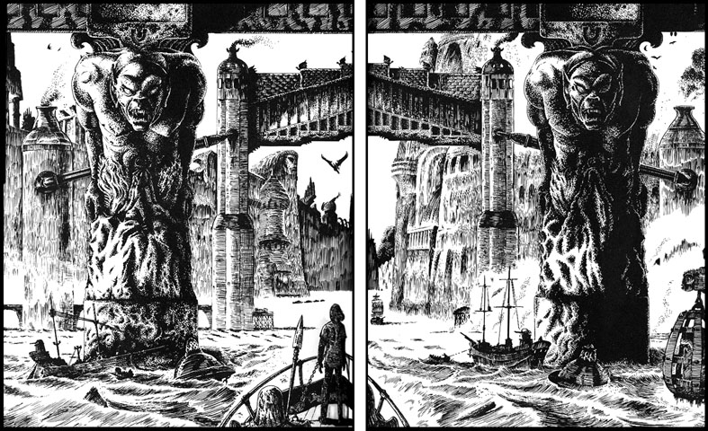
DB: Jewel is your best. It has, in the words of a recent reviewer, an atmosphere
of evil that is 'literally palpable. The hero, Dorian Hawkmoon,
sails up the river into the city; bridges, ships, buildings are
all alive.' The buildings and atmosphere have a very solid quality.
 JC: It had to be rooted in a quite solid sense of massed stonework
textures, et cetera, because the story itself quite often brings
out the texture of things; and those are the best passages in
the story, where Mike has time to dwell on the details of things,
so that the metal of the armour feels like metal, and the stonework feels like stone. It's the in between stretches which I think were probably
more hastily written, that are the let-downs, the weaker links.
I have not come to these yet. The first book, Jewel, is quite dense, there are very few gaps of that kind. It's the
later books when the heroes begin to travel around.
JC: It had to be rooted in a quite solid sense of massed stonework
textures, et cetera, because the story itself quite often brings
out the texture of things; and those are the best passages in
the story, where Mike has time to dwell on the details of things,
so that the metal of the armour feels like metal, and the stonework feels like stone. It's the in between stretches which I think were probably
more hastily written, that are the let-downs, the weaker links.
I have not come to these yet. The first book, Jewel, is quite dense, there are very few gaps of that kind. It's the
later books when the heroes begin to travel around.
DB: There is not much decoration in your work...
JC: I don't think too much decoration works in Sword & Sorcery because it does not produce action, and the genre needs to have movement: a page of Jewel for instance is more like the pace of Foster's Prince Valiant than say a Caniff or a Hogarth! Decoration, certainly, in order
to given an impression of the richness of the background, the
trappings and the dress, but that has to be incidental to the
action, because, above everything else it has to move. Decoration works in the decorative arts, for the Pre-Raphaelites
and such people. The whole recent fantasy scene has been trying
to reproduce a feeling of hallucination and drug-effects in artistic
terms...
DB: But there is more than a little of this mood and feel running
throughout Jewel. The LSD scene, in particular the hallucinogenic gases.
JC: Yes, they actually are bubbles of hallucinogenic gases, but that particular episode specified that these people were being affected by hallucinogenic gases. That particular scene could not be decorative in any way—it had to be terrifying. It had to say something which would terrify a group of people who were themselves well into hallucination. Its basis is actually more in religious imagery.
DB: In certain areas the Hawkmoon stories offer more scope for an
artist than, say, the Elric sagas.
JC: Yes, because they are more firmly tied to a realistic background
and they offer a mixture of what is actually Science Fiction and
pure Fantasy. The Science Fiction is of a kind that I particularly
like, which is a form of Victorian futurism. In other words it's
super science based upon an essentially mediaeval society, which
ties in a lot of scenes I saw when I was a kid and I was brought
up amongst the remains of Nineteenth Century industrialism which
are quite fantastic; the shapes of the ironwork and the machinery,
with which I was surrounded as a child.
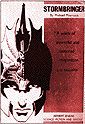 DB: You are probably best known for your illustrations for Michael Moorcock's books—Stormbringer, Sojan, Behold the Man, The Golden Barge, Warlord of the Air, et cetera. Are there any books you missed illustrating?
JC: I missed doing an edition of Stealer of Souls for which I still have the preliminary illustrations. I did a
page of Elric strip early on that has not been seen. For FRENDZ magazine I did a large Elric poster that was scheduled to be printed
over the centre pages, but the magazine folded before it could
be used.
DB: How did the first Elric drawing come about?
 JC: Part of The Flame Bringers was originally written as a non-Elric story, and I drew an illustration
of the central character. Mike then changed this to Elric by rubbing
out the pupils of the eyes, so that they were blank like the Elves'
eyes in Anderson's The Broken Sword, which is what he was probably thinking of at the time, and that
was one of the first drawings of Elric. Later, Mike incorporated
this story into The Flame Bringers.
JC: Part of The Flame Bringers was originally written as a non-Elric story, and I drew an illustration
of the central character. Mike then changed this to Elric by rubbing
out the pupils of the eyes, so that they were blank like the Elves'
eyes in Anderson's The Broken Sword, which is what he was probably thinking of at the time, and that
was one of the first drawings of Elric. Later, Mike incorporated
this story into The Flame Bringers.
DB: Wasn't there a similar origin to the Elric story Kings In Darkness?
JC: I wrote the plot of it, certainly. And one or two of the bits of
description that I used appeared in the story. The reason it never
really worked as an Elric story is that it was meant originally
to be a Conan story. The girl Zarozinia was added by Mike of course.
Since the story, as it stood, would have been too short and too
weak. It was intended as a very short Conan adventure, just a
typical straightforward kind of thing. Possibly because I know
its origin I have never really felt that it works, and I know
that Mike doesn't either.
DB: Coming back to your style, which has changed considerably over
the years. Who are your influences?
JC: My early commercial drawings were influenced by Rubens and Michelangelo. The two different styles—the earlier, cleaner, more formally posed work, and the later, rougher, sketchier style, are now integrated into one. There are also very few differences between the drawings I do for myself and the commercial artwork. In the very beginning the commercial artwork looked a lot stiffer and less natural, less spontaneous. The first time Mike got a commercial drawing from me it could have been from some other artist as far as he was concerned. I think he was rather disappointed. He would see the rather dynamic preliminary sketches, which he really liked, and the finished artwork would be a very formal thing, similar to the early Sojan drawings. I used Waverley nibs a great deal at this particular time, which contributed to the appearance. Going back to influences, with regard to the stipple effects I use, the Impressionists were a key influence. That early style was based on the monumental figures that many classical artists used. The massive, heroically proportioned figures were very similar to the figures of S & S heroes. But my subject matter was fantasy of the Planet Stories kind. I also used this style a great deal for Science Fiction
type of illustrations.
DB: I remember seeing an American magazine cover that you had rendered
very much in the Mervyn Peake manner, but you had used your stencil
technique.
JC: How Many Miles to Babylon. There was also another illustration I did in the same mould, of
children riding on a griffin. It was a direct copy of Peake's
black and white illustration. At the same time I put onto stencil
two very simple line drawings from The Quest for Sita, which was another book Peake illustrated.
DB: Your most successful stencil illustrations were for Tolkien's
Lord of the Rings. Have you any future plans for using this technique.
JC: I did in fact do some stencil work last year, but only in a non-commercial
capacity. It is possible that I will do more, perhaps for the
four Henry Treece novels you and Savoy are publishing in 1979. I will see how the initial stencils for
The Great Captains materialise before I commit myself!
DB: For the future, are there any long-term projects that you would
particularly like to embark on?
JC: It has been a long-term, cherished idea of mine to do an illustrated
version of A Princess of Mars. But I suspect that there will be a difficulty obtaining permission
from the Edgar Rice Burroughs Corporation. I have yet to see a
version that in any way captures the full Burroughs flavour. If
the opportunity arises I would be particularly pleased.
DB: Finally, to current work. Apart from the Treece books, you are
presently illustrating a very interesting book by Mike Moorcock,
which is to be published in 1979 by Pierrot and distributed by Big 0.
JC: This is a book about the history of Fantasy as a genre and presents
a very special problem from the artist's point of view. I have
to condense the essence of a number of classic fantasy books by
authors like Leigh Bracket, Jack Vance, C L Moore, et cetera,
into single spot illustrations that will be instantly recognisable
to the aware reader. To capture something of the atmosphere and
subject-matter of so varied a selection is a job I find very difficult
indeed, but it is one I am enjoying immensely. ◆
For further interviews readers are referred to Vortex Vol. 1, No. 1, 1977 and Science Fiction Monthly Vol. 1, No. 12,1974.
For more Cawthorn pictures, see the Cawthorn page in our Pictures section.
James Cawthorn in Savoy:
Graphic adaptations:
Stormbringer
The Jewel in the Skull
The Crystal and the Amulet
The Sword And The Runestaff (in preparation)
Illustrations:
Sojan (Michael Moorcock)
The Savoy Book
The Golden Barge (Michael Moorcock)
The Golden Strangers (Henry Treece)
The Dark Island (Henry Treece)
The Great Captains (Henry Treece)
Red Queen, White Queen (Henry Treece)
Savoy Dreams
Death Is No Obstacle (Michael Moorcock & Colin Greenland)
Introduction:
The Exploits of Engelbrecht (Maurice Richardson)